Sharing some of our favourite paint colours with Jessica Herman Interiors
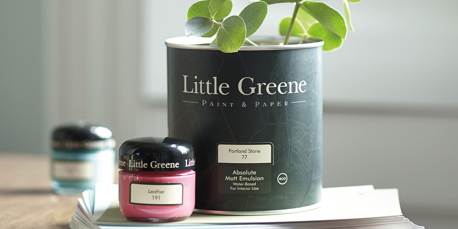
Redbrick’s Interior Designer, Jessica Herman shares some of her favourite Little Greene paint colours
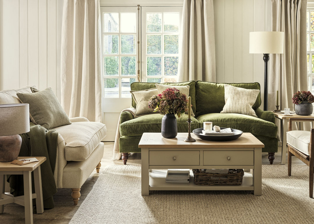
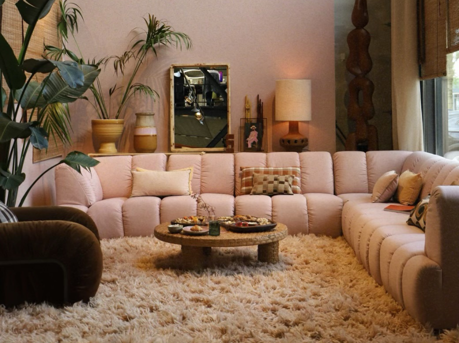
Many of us have re-redecoration and simple renovations in mind at the moment and a simple change of colour can make such a difference to our living space. We asked Jessica to share with us some of her top picks of Little Greene Paint colours to help inspire us when navigating our way through all the beautiful colour choices.
 JESSICA HERMAN INTERIORS
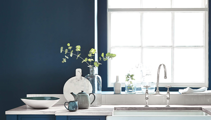
Hicks' Blue
Hicks' Blue is my go-to blue – it is the perfect shade and definitely not cold which is a common misconception with blues. It combines perfectly with nudes and neutrals and can work to create an authentic retro feel with natural wood, particularly teak or walnut. I find that blue is an extremely versatile palette to work within any room of the home, no matter what your interior style.

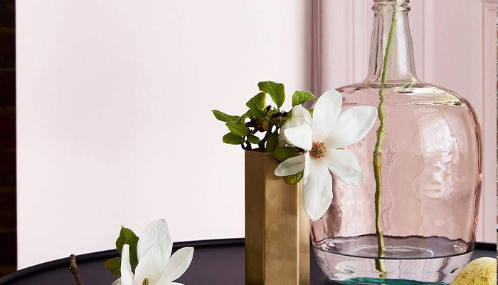
Dorchester Pink
This pale shade of pink is a vintage paint colour from the 1960s, from the interior of the iconic Dorchester Hotel - hence the name! It's great for a feature wall as it is a bold and imaginative choice, without being overpowering. I love to mix brushed brass accessories and accents with Dorchester Pink.

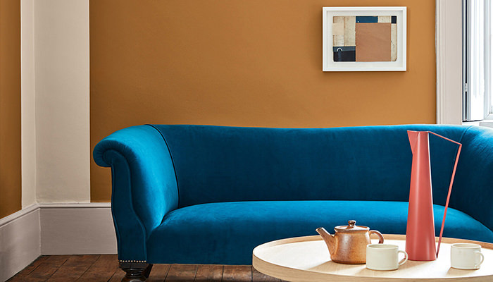
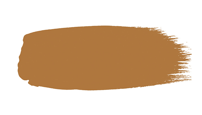
Middle Buff
Middle Buff is a deep orange-brown paint colour with a huge personality and creates a statement and a retro twist to any interior - I think it looks great combined with other bold colours, plus lots of greenery from plants and textured accessories such as velvet cushions and throws.
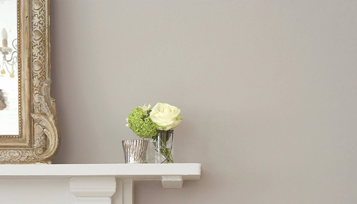
French Grey
This is my favourite grey, it's so versatile and comes in a range of tones from pale to dark so it's a great alternative to a classic white wall and really simple to achieve exactly the tone that you want. It's a great choice of colour for living spaces and so many of the Redbrick team have chosen French Grey and the result is always stunning whether it’s a contemporary or classic backdrop.
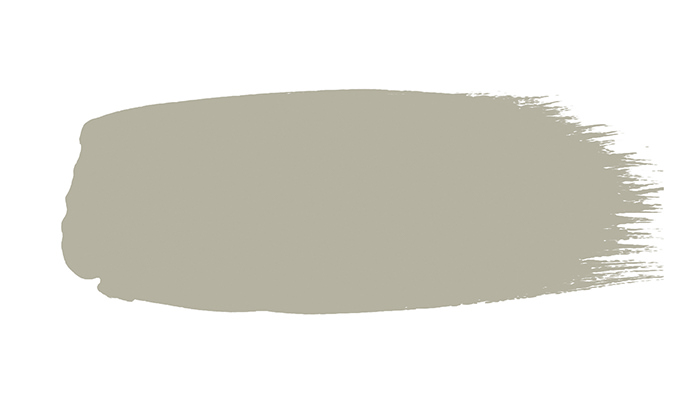
Portland Stone
Nude paint colours are really making a comeback and are a great alternative to greys. Portland Stone is one of my favourites...a pale stone colour which adds character and depth and works well in just about every room! What I love about Little Greene paint is that the
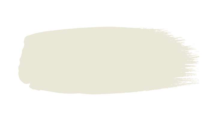
Scree
Scree started out as a mix of leftover paint colours – an early example of paint recycling! It looks amazing as an accent wall in a bathroom and also, I use Scree on many projects on external doors and window frames as it's not as harsh as black yet makes a bold statement plus it’s so long lasting and durable.
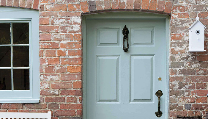
Celestial Blue
A dusky, pared-back take on a classic Sky Blue discovered on a rare surviving paint colour card from 1807. I love using Celestial Blue as a front door colour and my clients are always delighted with the outcome and more recently it has become increasingly popular as a bedroom colour because it's super calming.
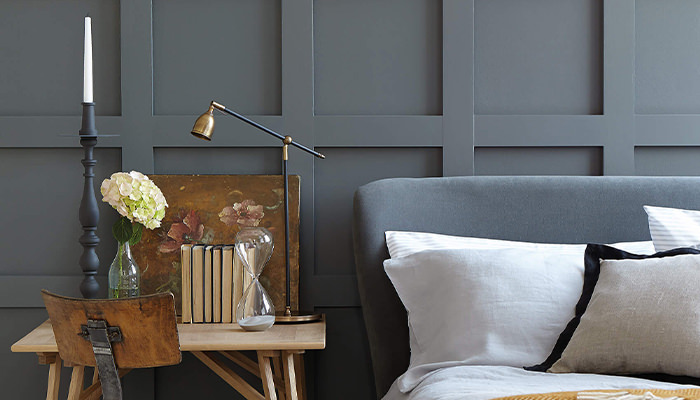
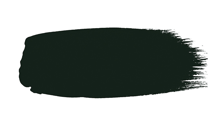
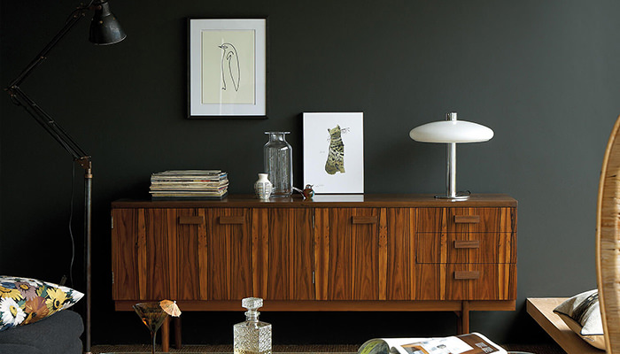
Obsidian Green
This is such an amazing and confident colour choice, it has so much depth and just transforms a room. I recently completed a bathroom project with Obsidian Green and used brass taps, fittings and a huge brass mirror which perfectly complimented the colour. And, another great alternative to black, Obsidian Green is an ideal colour choice for front doors and exterior railings.
We will look forward to hearing how you discovered your favourite colours and receiving your stories and images using the hashtag #MyRedbrickStyle